
Overview
A brand identity rooted in Korean symbolism, built for a handcrafted jewellery label that wanted to wear its origin with confidence. The mark carries centuries of meaning without announcing it.
Product or Service:
Brand Identity Design
Industry
Luxury Jewellery / Fashion
Deliverables
Logo, Visual Identity, Brand System
High Street Korea needed an identity that could hold two things at once: accessibility and quiet luxury. The name itself nods to the street, to the everyday, while the product, finest handcrafted jewellery, demands a presence that feels considered and rare. Generic luxury conventions were never going to work here. The brand needed symbols that were genuinely Korean, not borrowed, not decorative, but meaningful from the root up.
The Solution
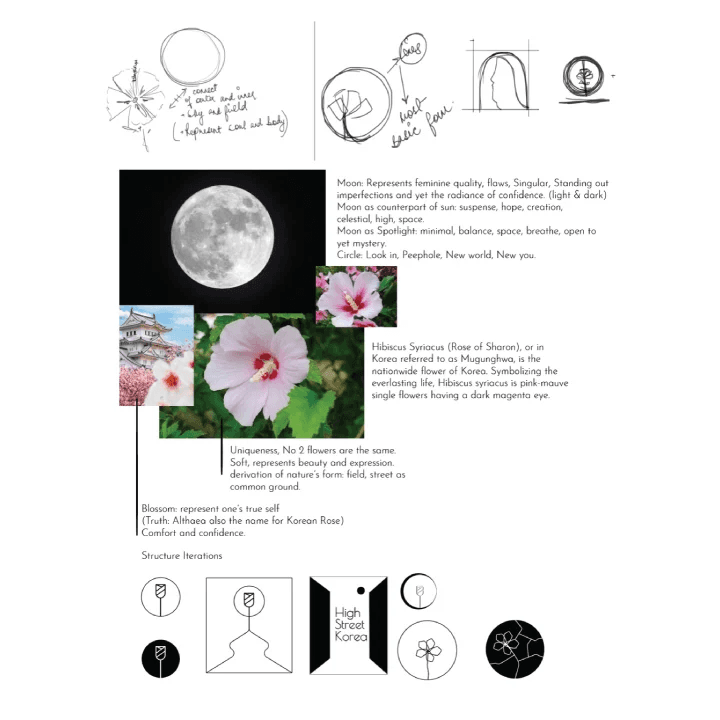
The process started with research into what Korea means visually and culturally, not as aesthetic reference, but as a source of real symbolism.
Two anchors emerged. The first was the moon. Feminine, singular, holding both light and dark, the moon represents imperfection worn with confidence, balance, suspense, hope. It became the structural idea behind the mark: a circle as peephole, a new world, a spotlight that is minimal and open yet full of mystery.
The second was Mugunghwa, the Hibiscus Syriacus, Korea's national flower. Also known as the Rose of Sharon, it symbolises everlasting life. No two flowers are identical, each one soft, expressive, a derivation of nature that finds its form in the field and on the street. The blossom became a representation of one's true self: comfort and confidence worn as identity.
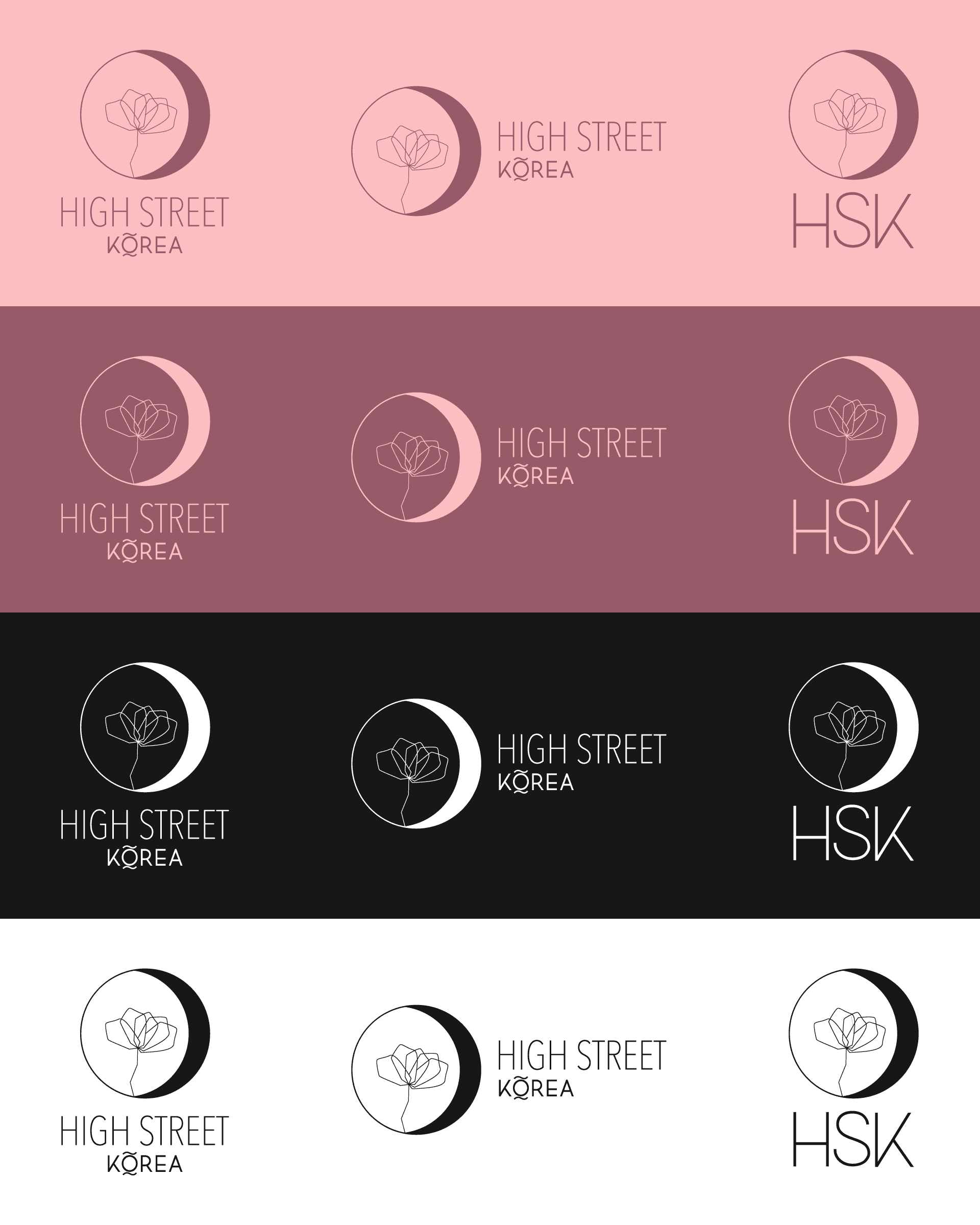
The mark was developed through multiple structure iterations, combining the flower and the circle, the natural and the geometric, until the two felt inseparable. The result is a symbol that rewards a second look. On first glance, a clean, minimal mark. On closer inspection, a story about where this jewellery comes from and what it stands for.
What was built
Brand research and symbolic framework. Logo mark developed through iterative sketching and refinement. Primary identity built around the moon and Mugunghwa. Full visual identity system covering typography, colour, and brand application.
Result
An identity that gives High Street Korea something most jewellery brands do not have: a mark with genuine cultural roots and layered meaning. The branding does not just look premium. It has something to say.

